Objects of desire: Rachael Gowdridge’s latest obsessions and inspirations
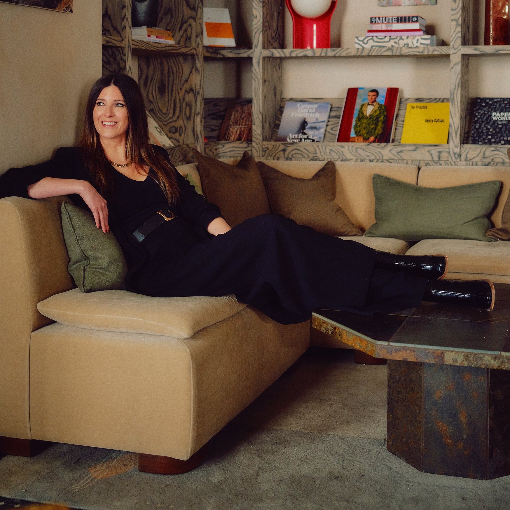
Rachael Gowdridge, Founder & Creative Director of her eponymous design studio, shares her latest obsessions and inspirations; from innovative materials and slow hotel stays, to a mouthwatering graphic design book
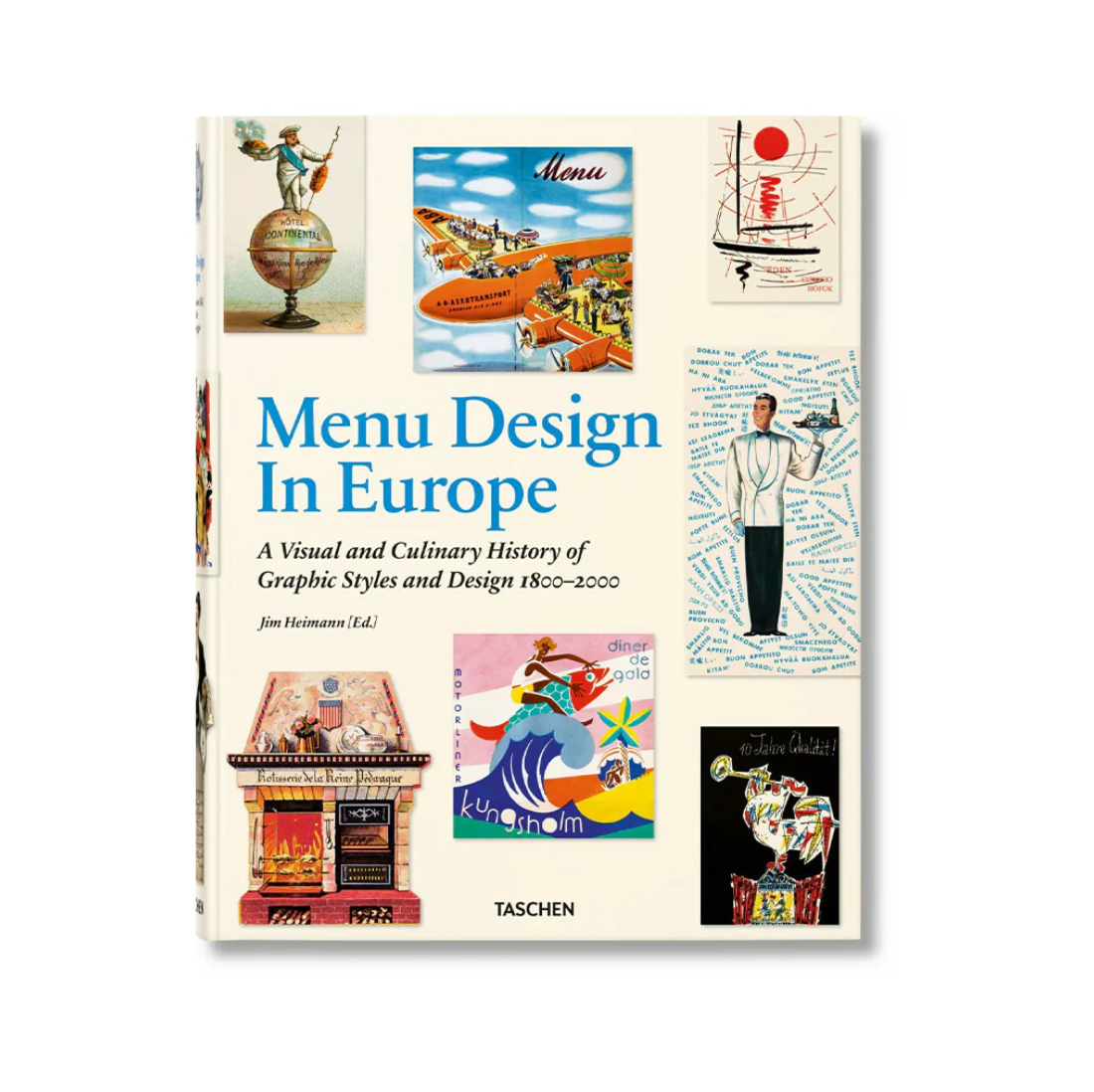
WHAT I’M READING
"Jim Heimann’s Menu Design in Europe is one of those books you can dip in and out of endlessly – it’s as much about graphic design as it is about food. Each menu really captures a moment in time, and I love looking at the detail. t’s a reminder of how much, beyond the interior design, it’s the smaller elements shape the overall experience."
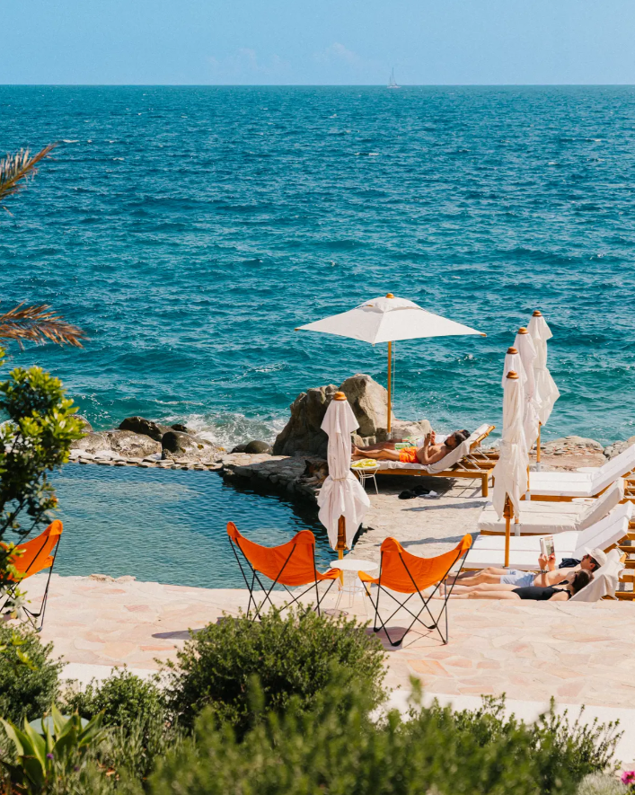
HOTEL DREAMING
"We spent a couple of days at Les Roches Rouges after a wedding last summer – it was the perfect place to switch off, listen to the sea, eat really good food and properly slow down. The design is simple and unfussy, which makes the setting do all the work and gives the whole place an easy, calming feel. "
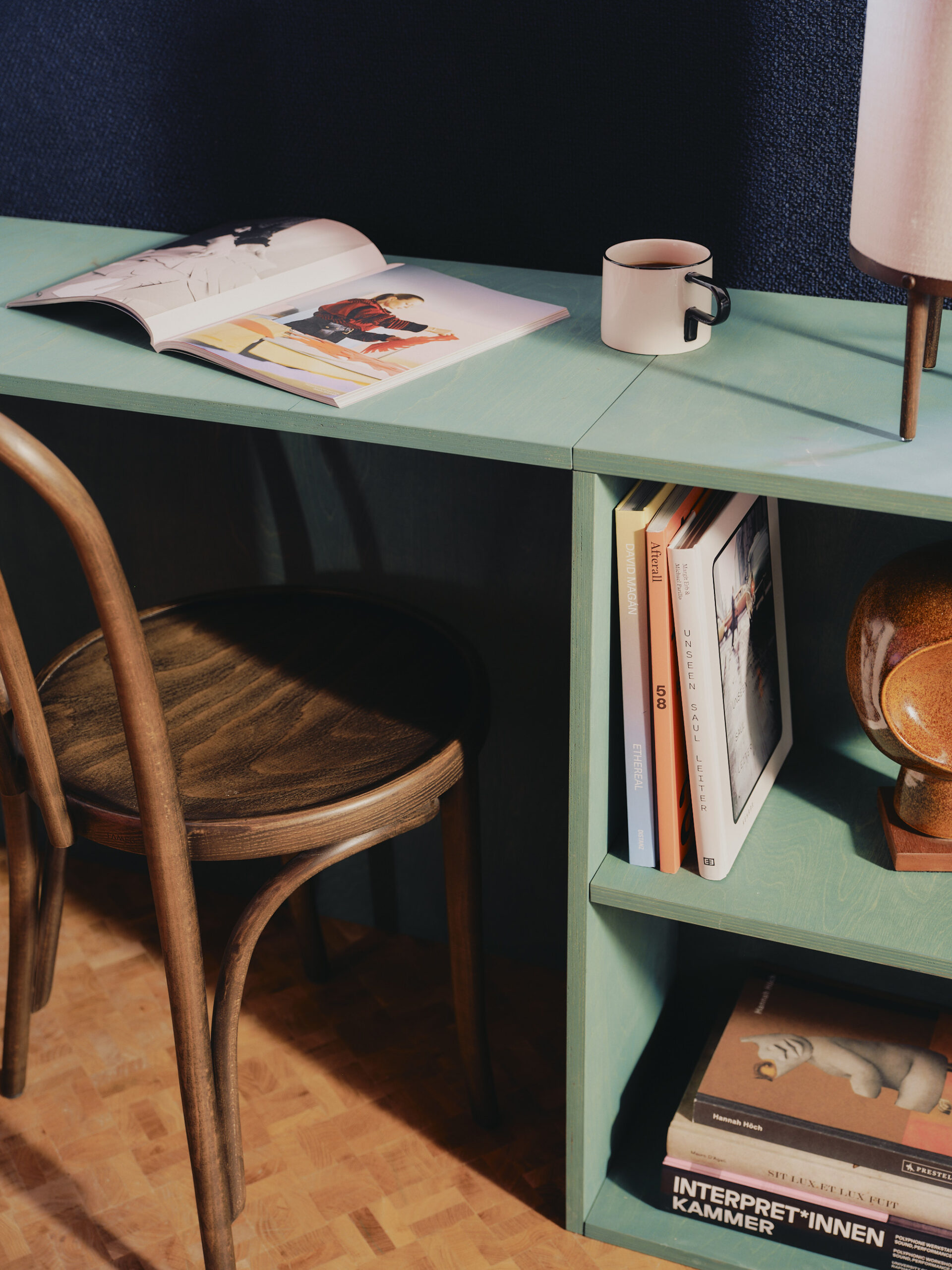
TOOL OF CHOICE
"Linolie is a linseed oil product and can be used on most indoor absorbent surfaces. It comes in a range of bright colours – we used it throughout our recent hotel project The Dean Berlin, as a contemporary, colourful interjection to the rest of the architecture."
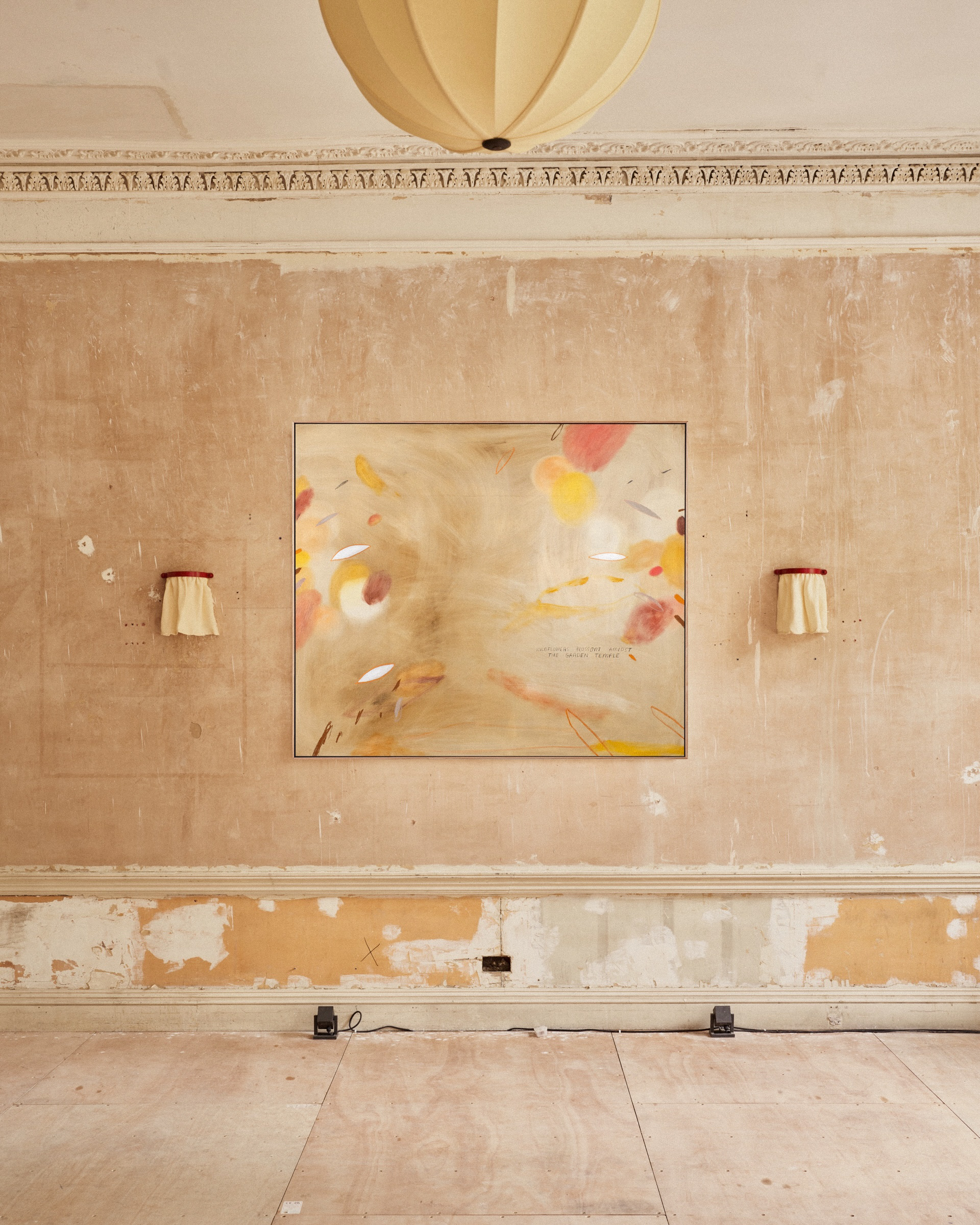
THE FINISHING TOUCH
"What draws me to Heath Wae’s work is the depth you get from the natural pigments – there’s a richness and softness that feels very different to anything synthetic. I’m also really drawn to the circular, almost portal-like forms; they give the pieces a quiet rhythm and make them feel calm but still full of energy."
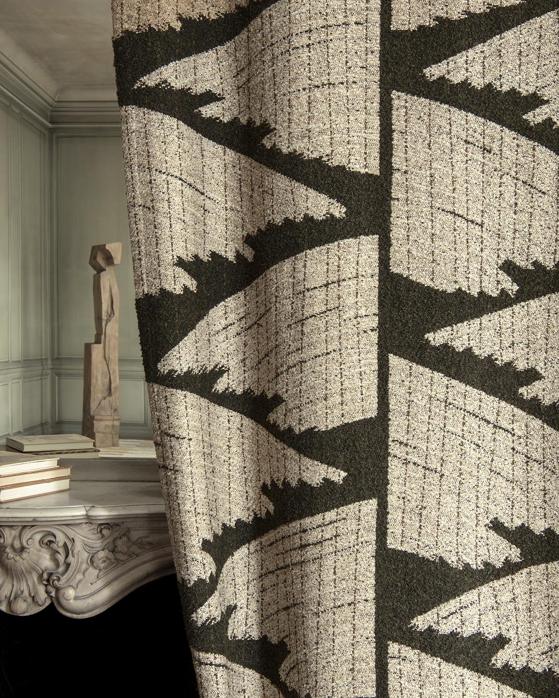
MATERIAL OF THE MOMENT
"We’ve long admired the Tazarine by Pierre Frey graphic Jacquard – it’s got beautiful tones running through it, and it’s really tactile in feel. We’re excited to finally be using it in an upcoming hospitality project."
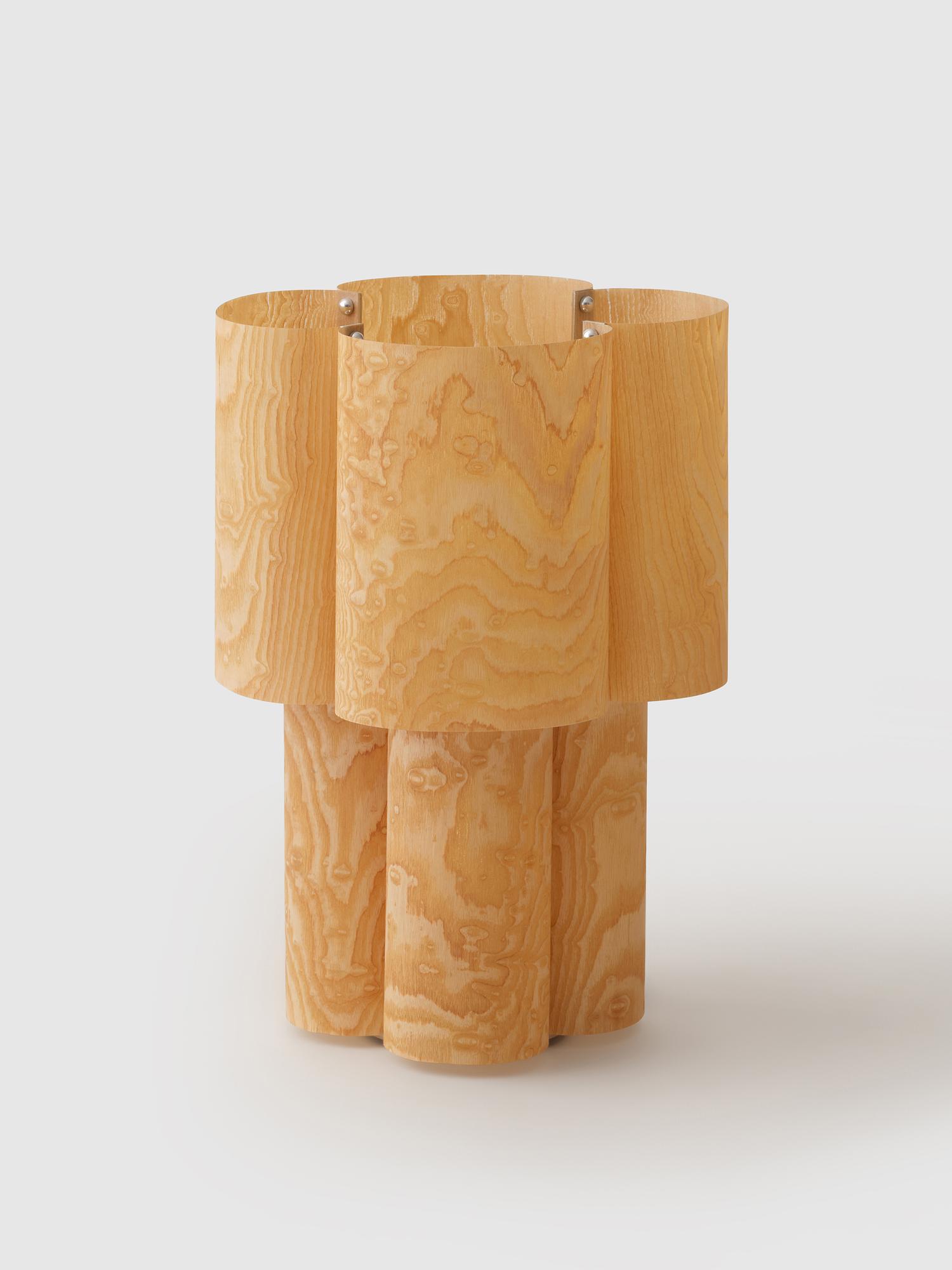
BRIGHT IDEAS
"What I love about the Soom Ash lamp by Hun Lee is the way it plays with wood and paper, treating them through the same making process so their differences really come through. When it’s lit, you notice the texture and character of each material, which makes it feel simple but really considered."
Related Articles

Leaders: Nobu CEO, Trevor Horwell on the blurring lines of hospitality
Restaurants, hotels, resorts and residences are no longer separate worlds. Trevor Horwell, CEO of No...
Read more
Preview: what to expect at Shoreditch Design Week
Shoreditch Design Week returns this September with an expanded programme placing material innovation...
Read more
Nick Jones takes on a new chapter with St.Clement
In his first venture since parting ways with Soho House, Nick Jones returns with St. Clement, and a ...
Read more
We'd love to hear from you! Click the button to open the SPACE Magazine Survey and have your say.

Make sure you don't miss a single issue of SPACE by subscribing to receive the magazine. Click the button above to signup.